How to customize your website color schema
Your online course platform needs a memorable color scheme to stand out, just like a strong logo does for your brand.
If you're uncertain about where to begin with color combinations, there's no need to worry. You can explore a range of predefined themes to choose from on OnlineCourseHost.com.
These pre-made palettes take the guesswork out of color selection, allowing you to preview different looks before applying them to your site.
Here, you can set up two key colors:
- Brand Primary Color
- Brand Accent Color
Ready to craft a custom color scheme that reflects your brand?
Head over to the Branding section in your OnlineCourseHost.com dashboard ( Admin > Settings > Branding ).
Choose a Predefined theme
The platform comes with different predefined themes that you can choose from, and preview, if you do not know how to get started with combining colors that would be suitable for your online school.

Set up brand colors
I advise selecting two brand colors (the major color and the accent color) for your online course business based on the feelings you want to convey to your students.
You can also see our related article on getting familiar with brand colors to choose the best colors that portray your brand.
If you do not know which colors to use, you can also select from the available themes (38 brand colors). That way, you can preview the colors and how they complement your website before applying them.
Brand Primary Color: This is the color that is the key feature to use inside your course (and on your sales page and course website). It’s what your audience will come to know well during their experience.
For example, the top header menu of your website uses this color, so it will be visible everywhere.
See the image below for more clarity:

Brand Accent Color: This is the secondary color that many buttons and other elements will use on your pages.
The goal of this secondary color is to call attention to a particular element of the page, so the color should be very different from the primary color.
See the image below for more clarity:

Brand Footer color: This is the color that will be displayed in the area located at the bottom of every page on your website.
See the image below for clarity:

Sales Page Banner Color: This is the color that will be displayed on the course sales page, directly underneath the branding primary color.
See the image below for more clarity:

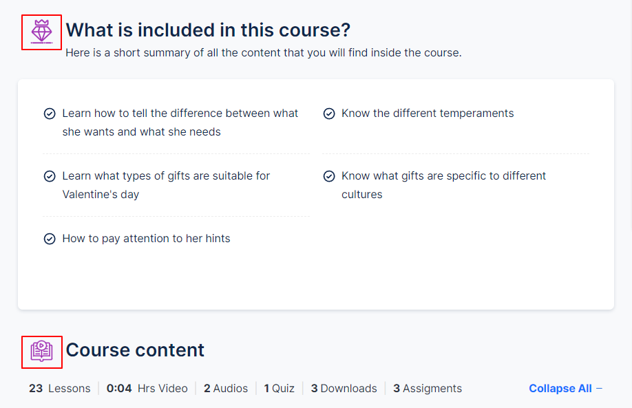
Section Title Icon Color: This typically refers to the color of the icon that appears next to the title of a section on a website or application. This color setting allows you to customize the appearance of the icons associated with section titles, aligning them with your brand colors or the overall design theme of your platform.
See the image below for clarity:

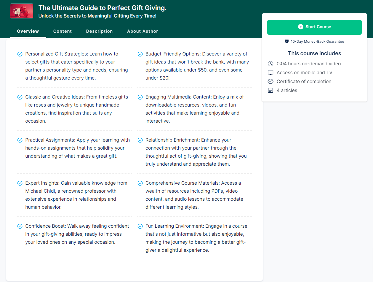
List Item Icon Color: This refers to the color of icons that appear next to individual items in a list. These icons are commonly used to visually represent or emphasize each list item, providing a more engaging and organized layout for users.
See the image below for clarity:

Choose your brand colors
To choose your brand colors, you can either type in the color codes if you have them or find the perfect tone using the color picker:

Note: The color codes you see at first glance are the default colors, which you can always change by deleting and typing in yours.

After picking your colors, scroll down, and click on Apply Brand to apply your color combination throughout your website.
Do you want to know more about color codes? Read this on hex color codes by December.com.